My Most Used Test Heuristics (with examples)
First, what is a heuristic?
A heuristic is a guideline, it is fallible. Therefore, it will give you a good idea of what behaviour you should see BUT it isn’t definitely what should happen - it\’s up to you to confirm that the behaviour you are seeing is correct. In a previous blog post I shared a step by step guide on how to test without requirements/little requirements. But I figured it’s good to share my most used test heuristics that I use for testing without requirements. They are:
- Consistency with History
- Consistency with User Expectations
- Consistency within Product
Let’s take a look at each of them along with some examples to illustrate the concept.
1. Consistency with History
The feature’s or function’s current behaviour should be consistent with its past behaviour, assuming there is no good reason for it to change. This heuristic is especially useful when testing a new version of an existing program. (Source: developsense)
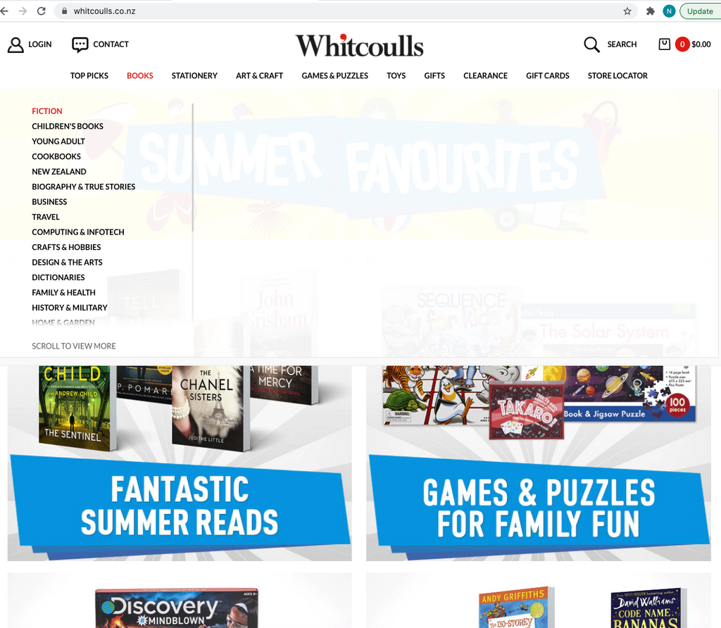
Example: Whitcoulls, a NZ book store.
Here you will notice that their products are broken up into main categories: Top Picks, Books, Stationery etc.
Then under Books you have Fiction, Children's Books, Young Adult, Cookbook etc.
To test against this heuristic, then let's say you were to redo/revamp/remake this website, then you would expect the products to be broken up into the same main categories (Top Picks, Books, Stationery..) and the Books to have the same categories (e.g. Fiction, Children's Books etc.)


2. Consistency with User Expectations
A feature or function should behave in a way that is consistent with our understanding of what users want as well as their reasonable expectations. (Source: developsense) Example: Signal, messaging app. In the first photo: I expect that the “Search/Sök” functionality searches for both contacts I have as well as messages containing the search string. For example: “And..” would find a contact called Andreas as well as a sentence “I have coffee and tea” I expect that the pen icon in the top right corner means I can create a message I expect that the camera icon means I can take photos once I tap it. If I haven’t yet given permission to the app to access my camera or photos, then a pop-up should appear

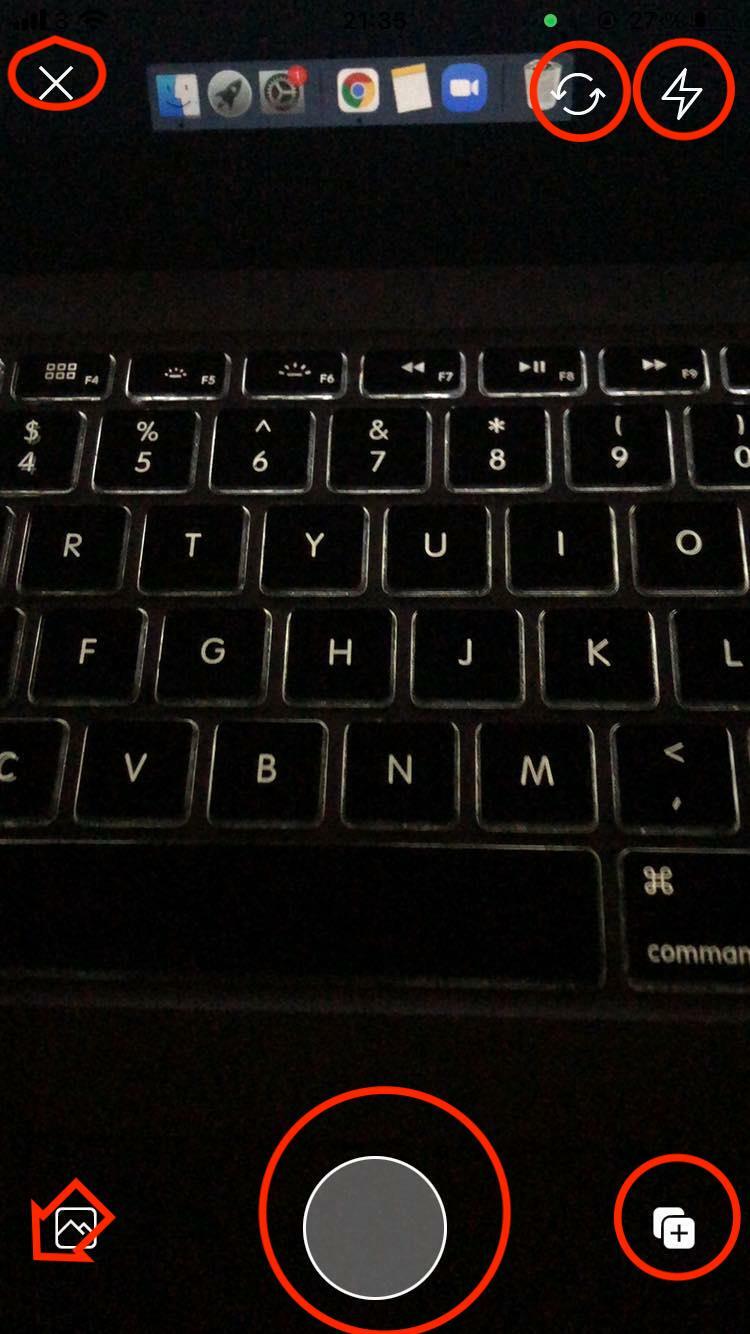
In the second photo: I expect tapping on the X on the top left means I exit the camera view I expect that tapping on the two arrows means it switches to selfie mode etc

If I were to be part of a project that was building a messaging app and was focussing on the camera functionality, I would ask myself - what do I expect to happen? I sometimes find Consistency with User expectations can start to blend into Consistency with Comparable Products when I test. (Consistency with Comparable Products: Using other products as a rough, de facto standard against which our own can be compared. Source: Developsense) If i was testing against the Consistency with Comparable Products heuristic, I would ask myself: “What do other messaging apps have? How does the camera functionality work on other messaging apps?”
3. Consistency within Product
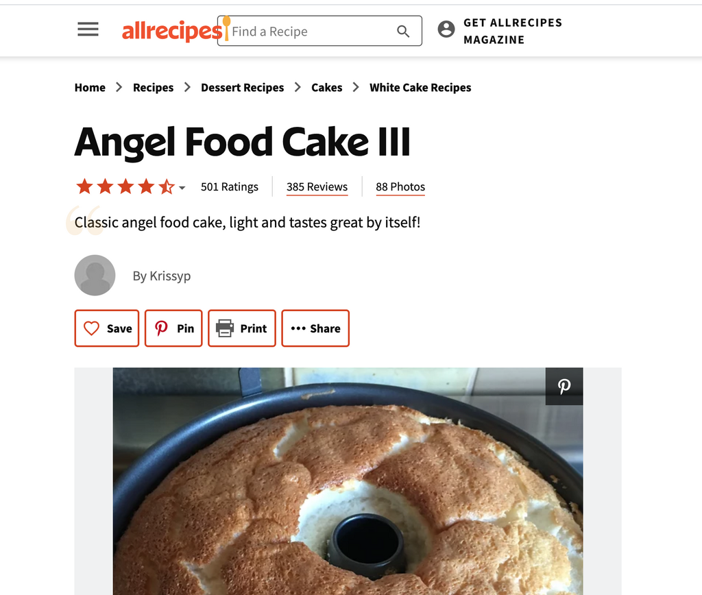
The behaviour of a given function should be consistent with the behaviour of comparable functions or functional patterns within the same product unless there is a specific reason for it not to be consistent (Source: developsense) Example: Allrecipes, a recipe browser To some extent this behaves as I expected as I see the breadcrumb which helps me find where I am on the website, but on the /desserts page it is lower down the page, on the actual recipe page, the breadcrumb is at the very top. See screenshots below


For more details on testing with heuristics, check out my eBook
📹 If you enjoyed reading this post, check out my YouTube channel and subscribe.
I post videos that can help you with your software testing career.